

Applying Spatial Scan Statistics to London’s 1854 Cholera Epidemic

Map 1: this map is a composite of several layers including John Snow’s original map, Edmund Cooper’s Sewer Commission map and a street view background created by Robins (2013). Our map displays statistically significant clusters where the relative risk of dying from cholera is greater within than outside the circle. It includes data collected by John Snow from the period from August 19th – September 30th, 1854.
Introduction
This post explores methods for utilizing SaTScan, a spatial scan statistics program, with Geographic Information Systems (GIS) in the context of data-poor environments. Specifically, we will be working with John Snow’s data collected during London’s 1854 London cholera epidemic, accessing a range of tools available in ArcMap to see if we can identify high risk clusters and calculate their respective relative risks (R.R.). Deploying scan statistics for cluster detection can be very useful in a public health context and this paper provides an opportunity to work through a real-world example. In this paper we implement a range of tools available in ArcMap building upon methods devised by other researchers to assist us in obtaining an estimate for a population at risk in John Snow’s original study area, a crucial figure for running scan statistics. We will be able to compare our own findings to Snow’s and assess our methods accordingly. We expect to find at least one cluster with high relative risk at or near the Broad Street Pump. Before continuing it is important to acknowledge two limitations with this project.
As we proceed, it will become clear that the scope of this project requires us to make educated estimates on several important factors, including the population at risk. Because we are working with estimates, the figures we use will be imprecise. Second, the dataset we will be drawing from was originally published in 1855 and it may itself be imprecise. John Snow, speaking to this point, cautioned that his data was incomplete, for instance not capturing the deaths of residents who contracted cholera and later fled London, dying in the countryside (Snow, 1855, p. 45). Snow (1855) argues that his data, however imprecise it may be, still conveys an important story and helps to identify the Broad Street Pump as the point source of the 1854 cholera epidemic (p. 45-46). As we explore Snow’s data and apply cluster detection methods we should keep this in mind. Again, the primary goal of this paper is to explore ways one can incorporate the GIS methods described below to become more familiar with the SaTScan program and consider ways one might utilize it if key population data is unavailable.
The following section provides an in-depth discussion on the methods used and gives a rationale for why these were chosen. This section is followed up by a discussion on what was observed and references two maps, and an accompanying table containing key SaTScan output. We will look at Snow’s original work and ask if our observed results were expected. We then conclude with a brief discussion of our findings.
Methods
Our first task is getting the data in the format needed. We will utilize data provided by Wilson (2013), a researcher from Southampton University who has georeferenced all of John Snow’s 1854 outbreak data, including death and water pump locations, available to the public for download at The Guardian’s DataBlog (see Rogers, 2013, March 15). When we import this data into ArcMap we observe a georeferenced raster image of Snow’s map set to the OSGB 1936 British National Grid projection coordinate system. We also have point files for the 489 deaths and 8 water pumps recorded in Snow’s (1855) study area, including the Broad Street Pump.
Snow (1855) discusses his rational for choosing his study area, observing “The most terrible outbreak of cholera which ever occurred in this kingdom, is probably that which took place in Broad Street, Golden Square, and the adjoining streets, a few weeks ago. Within two hundred and fifty yards of the spot where Cambridge Street joins Broad Street, there were upwards of five hundred fatal attacks of cholera in ten days. The mortality in this limited area probably equals any that was ever caused in this country” (p. 38). He limits his investigation of the cholera outbreak to this area because it appeared to produce alarmingly high mortality rates. He collected data for the Soho neighborhood of London from the period between August 19th and September 30th, 1854 (Snow, 1855, p. 46). This is the area we see on the map georeferenced by Wilson (2013) and it will serve as our study area as well. We will refer to it throughout the rest of this paper simply as Soho. In Snow’s 1855 map we see deaths indicated by black bars, overlaid by points added by Wilson that provide a location and a count. This is where we find that there were a total of 489 deaths from cholera. It should also be mentioned that households reporting no cholera deaths are not identified on Snow’s original map. We will use this data to run scan statistics but we need to obtain data on the population at risk first.
To do this, we turn to Koch & Denike (2009), who ran into the same problem when they attempted to calculate a mortality ratio, and resolved this issue by overlaying maps that identified all of the houses in Soho, that would have been available to Snow, allowing them to count the number of houses and estimate a rough population for the area (p. 1247). For this paper we will follow a similar process. One of the maps used by Koch & Denike (2009) was produced by Edmund Cooper (p. 1247), which we will use to create a composite with Snow’s 1855 map. This will allow us to estimate a population at risk and finish our analysis. It may be of interest to note that Snow’s cholera map depicting where each cholera-related death had occurred was not the first map published on the 1854 epidemic; it was actually Edmund Cooper, employed by the Metropolitan Commission of Sewers, who is credited with producing the first cholera map for this area during the outbreak and his map was a little more detailed, containing every house in the Soho area of London (Brody, Rip, Vinten-Johansen, Paneth & Rachman, 2000, p. 66). Cooper was investigating claims by some that sewer lines that crossed older plague burial grounds and were transporting noxious air into households, bringing with it cholera, but he obviously found no evidence of such a link (Brody et al., 2000,p. 66). Nevertheless, his map will help us in obtaining an estimate for the population at risk. Brody et al. (2000) remark that it is curious that Cooper and Snow, who both created detailed maps of the outbreak and had similar data, could not agree on the source of the 1854 outbreak (p. 66). If they had scan statistical tools available, perhaps their findings would have led them to a consensus.
We will use scan statistics to confirm Snow’s hypothesis that the Broad Street Pump was the source of the outbreak, and we look to Cooper’s map to help capture some data that is currently missing from Snow’s map. We use the georeferencing tool in ArcMap to georeference Cooper’s map, saving a scanned image (available to the public for download online) as a JPEG and importing it as a raster file into ArcMap. The georeferencing tool allows us to overlay this map on top of the one produced by Snow, and give it spatial coordinates. We are careful to keep the same OSGB 1936 British National Grid projection coordinate system. Following this we see that the street grid on Snow’s map matches the street grid on Cooper’s, and that houses for most of the Soho neighborhood fill in the blocks.
Our next step involves creating a new point feature class. We need to make a new georeference database, calling it “Pop_At_Risk”. Then, using the editor tool, we proceed to draw points over each household. There are some areas on Snow’s map that do not overlap with the Cooper map, and we estimate the number of households for these blocks based on what we have assigned to areas of similar size. Following this, we open up the attribute table of our newly created point features and add fields (short integer) for Population at Risk and Deaths. We will go through the map and assign cases that were provided by Robin (2013) to the area on the map where case points and population points correspond. In deciding on the household size we again look to Koch & Denike (2009), who estimated the mean average household size for this area of London at the time to be about 10 people per household, based on 1851 census data (p. 1247). We can then go into Google Earth street view and verify that most households in this area are limited to 3 or 4 stories and a population of 10 per home seems reasonable.
We are assuming that everyone who resides in Soho is at risk of cholera because area residents likely obtain drinking water from the same local sources and cholera can be transmitted through contaminated water. Again, this is imprecise but will work for our purposes. Another way to do this might be to create two or three different “Population at Risk” fields, with varying estimates and running our analysis for each. For the purposes of this paper we limit our scope of analysis to this estimated population at risk. Our total population at risk for our analysis is 15,435. We now have a master population shapefile that contains the number of cases, the estimated population at risk and their spatial location.
Our final step before running scan statistics is assigning an X and Y Coordinate in decimal degrees to each location in our master population file. To do this we simply add two new fields for X and Y, select calculate geometry, set our properties to the corresponding X and Y coordinates and ensure our units are in decimal degrees. We then set SatScan to conform to our analysis by setting the parameters described below.
We set SatScan to run a purely spatial type of analysis using a discrete poisson probability model, scanning for areas with high or low rates. We set our maximum spatial cluster size to 2.5% of the population at risk using a circular scanning window and run 999 replications. After running SaTScan we find 9 statistically significant clusters, identified on Map 1 as clusters 1-9, all with higher than expected rates of cholera. Residents of households falling within these clusters will be at greater risk of contracting cholera compared to those living outside. When viewing the statistically significant clusters in ArcMap, we observe that the broad street pump, the source of the cholera epidemic, falls almost in the center of Cluster 1.

Table 1
Discussion
From our map and our table of key SaTScan output data above we can draw several inferences. First, cluster 1, the least likely to occur by chance, centers almost directly over the Broad Street Pump and contains 42 cholera related deaths and a relative risk (RR) of 9.26. Residents of houses within cluster 1 were at a 926% higher risk for contracting cholera, compared to those not residing within the cluster. We observe an even higher relative risk in cluster 2, which reports one fewer cholera-related fatality. We then observe a drop in RR to the still high levels of 4.99 in cluster 3 and 4.84 in cluster 4. Curiously, SaTScan identified clusters 5 and 6 as having very high RR, but with very small populations.
In considering our final output data, it is important to recognize that while clusters 5 and 6 have extraordinarily high R.R. and are statistically significant, their populations are very small (1 house each), and this has the effect of distorting our R.R. figure. Upon reviewing the SaTScan output for cluster 5, we see that only one household, FID 257, is included and appears at the center of the cluster. In examining the data for cluster 6, we observe a similar phenomenon, again with only one household, FID 490, appearing in the center of the cluster. For the purposes of this exercise, we removed these two clusters from the final map to avoid confusion or misinterpretation of our findings.

Map 2: the only change to occur in this final map is the removal of clusters 5 and 6, for reasons explained above.
In our final map, we see that cluster 1 centers over the broad street pump, with several other statistically significant clusters located near this area, confirming Snow’s hypothesis. This paper demonstrates how one can utilize scan statistics to perform cluster detection in data poor environments, as long as one possesses enough information to make informed population estimates. The methods describe above may have similar applications to other data-poor settings, including outbreaks of vector borne illness in refugee/Internally displaced persons camp where resources, especially data, may be limited. It provides a method for determining areas with statistically significant clusters of an outbreak. What was not demonstrated in this paper was SaTScan’s ability to also identify clusters of lower R.R. that might provide some crucial insights into what factors might assist in mitigating an outbreak. This should be an area for further investigation.
Works Cited:
Brody, H., Rip, M. R., Vinten-Johansen, P., Paneth, N., & Rachman, S. (2000). Map-making and myth-making in Broad Street: the London cholera epidemic, 1854. The Lancet, 356(9223), 64-68.
Koch, T., & Denike, K. (2009). Crediting his critics' concerns: Remaking John Snow's map of Broad Street cholera, 1854. Social science & medicine, 69(8), 1246-1251.
Snow, J. (1855). On the mode of communication of cholera. John Churchill.
Data Sources:
Michael (2013, April 13). DataViz history: myth-making and evolution of the ghost map. Retrieved from: http://datavizblog.com/category/henry-mayhew/
Rogers, S. (2013, March 15). John Snow’s data journalism: the cholera map that changed the world. Retrieved from: http://www.theguardian.com/news/datablog/2013/mar/15/john-snow-cholera-map
Topographic Trail Map of Pennsylvania's Black Forest Trail

Map of the Black Forest Trail by Christian Przybylek
This map features the Black Forest Trail, a rugged and remote 42-mile looped hiking trail that traverses through north central Pennsylvania’s Tiadaghton State Forest and is nestled within the heart of the Pennsylvania Wilds.

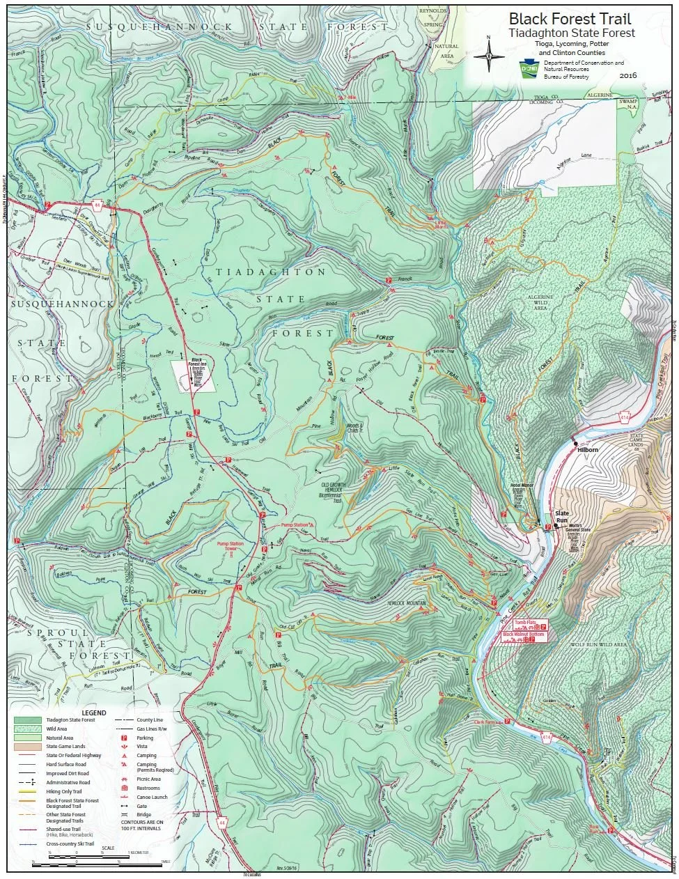
DCNR Map of Pennsylvania’s State Forest Trails
The Black Forest Trail (colloquially known as the BFT) is a special place for me and is one of the most memorable trail hiking experiences I’ve had. I discovered it back in the summer of 2015. My wife and I were in our final year of grad school, and it was grind. We were both attending school part time, taking evening classes and working full-time (50ish hour weeks) at non-profits and needed a break. We had started mapping out plans for post grad school life and landed on trying to complete a thru-hike of the Appalachian Trail (which we successfully thru-hiked a year later, in 2016!). While I was an avid backpacker and she loved camping, we recognized that a thru-hike of the AT was going to be challenging and we both would benefit from more experience and practice. At 42-miles, the BFT was something that could be done in 4 days and was the perfect trail to test ourselves and give us something to look forward to before summer ended and we went back to class. In August, we laced up our boots and left the hustle and bustle of Philadelphia for the quiet solitude of the Pennsylvania Wilds.
While I had grown up going out on multi-day backpacking trips, this was the longest hike I had taken at this point. My wife had been out once overnight as a teenager and together we had gone a handful of overnights on the AT, but none of our hikes were as long as the BFT. One thing we discovered was that we were not as prepared as we could have been, which was kind of the point of this test hike.
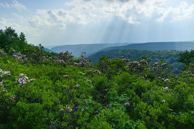
Photo by Rob Vaughn
We had packed an assortment of odds and ends, some things we needed, but a lot of things that superfluous to our packs and just added extra weight. Between us, we had two heavy winter mummy sleeping bags, a mess kit, a bulky water filter, a pocket rocket stove, a knife, some ponchos, two foam sleeping pads, a lightweight, but tight, “two-person” Kelty backpacking tent (which really was designed for one person), notebooks, and books (these were not a good idea in hindsight, for our AT thru hike we did bring a Kindle as an “luxury item”, which allowed us to read, but saved us some space and weight). We also wore jeans and cotton shirts, which we learned were not great for a long multi-day hike. Our clothes quickly got wet, heavy, and smelly. If I were planning this hike again, I would pack two pairs of running shorts (one for camp, one for hiking), a long-sleeved hiking shirt that I could adjust, a set of thermal underwear, some good wool socks and a pair of crocks (also for camp). I cannot recall exactly how heavy our packs were once they were fully loaded, but we had too much weight for a relatively short 42-mile trek. Still, we had an amazing hike, and it was an absolute blast!
The BFT is very scenic and covers a vibrant landscape. The trail traverses multiple mountains (I believe the trail has you climb seven mountains in total), which are covered in dense and ecologically diverse forests, interspersed with small meadows and beautiful edge forest habitats. Scattered along the trail are multiple vistas affording spectacular views across a seemingly endless horizon of mountain ridges. The forest also has an abundance of cold-water streams and small waterfalls, muddy wetlands and sandy springs and seeps. When we got on the trail it was the end of summer and our days were hot and muggy. However, once the sun began to set, the mountain air became cooler and the evenings were quite comfortable. During our four nights out, we endured multiple heavy downpours and thunderstorms, which was at times a little unnerving, but also kind of amazing. The weather also made for dramatic scenes at vistas, with clouds blanketing the valleys below and only the ridges of other mountains visible in the distance, making it seem like you were floating on an archipelago of sky islands.
For how beautiful this area is, I was surprised by how few people we met along the way. We felt like we had the trail to ourselves. During our hike, we encountered maybe two other hikers and a person doing work along a gas line corridor for a utility company. Perhaps it was the time of year, or the fact that were doing most of our hike during the middle of the week (we had started on a Sunday night and finished on a Friday morning), but I had expected to run into more hikers, not that we were complaining.
There was a lot of wildlife to enjoy from a distance. We saw plenty of deer, various species of song birds, and several species of snakes, including a few rattle snakes who kindly let us know of their presence. At night, warm in our sleeping bags, we heard the distant calls of coyotes howling and the persistent hoots of owls filling the chilled evening air and the rustle of tree branches gently swaying in the breeze. It was a gorgeous setting and an almost pristine environment. It also proved to be a good training ground for our future Appalachian Trail adventures.
The BFT is as rugged as it is remote. Some of the climbs are incredibly steep, requiring more technical footwork. It had sections similar to some of the more challenge sections of the Appalachian Trail. While the climbs up steep terrain was challenging, I sometimes found that going downhill was just as difficult, it not harder. Knowing what I know now of the BFT, if you are planning to hike it, I would recommend trekking poles. We did not have these along, but I think our knees would have thanked us if we had (we did pick these up ahead of our AT thru-hike and they really helped protect our knees, especially when going downhill). In terms of water, there were an abundance of streams, springs, and seeps as sources of drinking water. Of course, we always filtered our water (if you don’t, you really should), and I remember the water tasting fresh and minerally.
It was an exhausting couple of days, and we were both physically spent by the end of it, but it was also one of our most memorable hikes. The forest was alive with the accompanying sounds, sights, and smells of an ancient living forest, which has hosted humans for thousands of years, and it was beautiful. The night skies were also epic (when we had clear weathered nights). The north central Pennsylvania region has minimal light pollution and is known for its amazing stargazing. The BFT runs close to Cherry Springs State Park, known for having some of the darkest skies in the United States, making this the perfect area for stargazing. From the area, you can see a band of our Milky Way galaxy with the naked eye. If I were to do the hike again, I would plan to camp one night just below a vista and hike up in the evening to look at the stars (maybe bring a flask of whiskey and a banjo), assuming good weather conditions for stargazing. Those vistas would afford stunning views of the night sky on clear evenings. Especially if there was a meteor shower.
Approach for Making the Map Above
The BFT is one of my all-time favorite hikes and I wanted to see if I could make a map that effectively shows how varied the terrain of the trail is. My map incorporates multiple hillshades (both traditional and multidirectional) as well as a National Wetlands Inventory (NWI) layer to show hydrology, and a United States Geological Survey (USGS) basemap overlay. For the USGS basemap overlay, I experimented with various blend modes in ArcGIS Pro and settled on the luminosity mode. This brought the hillshade layers underneath the USGS topo map “up” and gave my 2D map a 3D feel. I then added the line layer for the BFT trail, displayed in orange to match the trail blazes. I also baked in some crinkled paper effects to make the final digital map look less “perfect”. With mapping as with most things in life, I find that beauty is found in the imperfections and trying to build imperfection into my maps helps avoid the uncanny valley vibes of a neatly rendered digital map that looks too clean. After a little fine tuning with layer symbologies, I landed on my final map of the BFT.
I also wanted to include an official map of the trail from the Pennsylvania Department of Conservation and Natural Resources, which you can see below:
If you are looking for a great, week-long hiking adventure in the Northeastern United States, I highly recommend checking out the BFT. you want to plan your hike and I highly recommend getting a BFT guide book. Its inexpensive, lightweight, and provides an excellent level of detail that will be indispensable for your hike. Happy trails!

Cartography of The Handmaid's Tale: Finding the Population of Gilead, The Resistance and More Using Open Source Data and GIS
A fictional map of the Republic of Gilead and an analysis of its population, based on US Census Bureau data.
Warning, spoilers ahead!
I am a big fan of the novel The Handmaid’s Tale, by Margaret Atwood and its accompanying television series on Hulu. Both offer chilling insights into some of the darker realities present in our world today. In the television series, I especially appreciate the level of detail and care the show’s production team puts into world building and set design. For those unfamiliar with the show, it is set in an alternative United States around 2014 (the date of a key event in the show is published in the Boston Globe (click here for link to a newspaper headline from the show)) during what appears to be a global infertility crisis linked to environmental degradation that has resulted in fewer live births and plummeting fertility rates globally. With the crisis as the backdrop, a shadowy militant religious cult, called the Sons of Jacob, seizes control of part of the United States by successfully overthrowing the US government and instituting a theocratic regime, the Republic of Gilead. In the first seasons, we catch glimpses into how the regime operates through characters who appear to be key figures within the new government and those under their subjugation.
The regime is defined by its brutality. It reinforces its tenuous claim to power through extreme acts of violence and terror. Many women are forced into reproductive slavery, members of the LGBTQ community are forced into hard labor or worse, sham trials and extra-judicial executions appear common, protest is not tolerated and the reaction of the world outside Gilead appears cautious. We know that Canada and other NATO-aligned countries are not yet recognizing Gilead’s legitimacy and the regime appears to be isolated in the international community. We also know that an American government is operating out of Anchorage, Alaska, with Alaska and Hawaii being the two remaining holdouts not to leave the Union. There are a lot of moving threads and subplots that make the show’s characters rich and the series gripping to watch. I wanted to know more about this world.
I am a geographer who works with Geographic Information Systems (GIS) in my day job and became interested in knowing how much territory is under Gilead’s control. There are off-hand comments in character’s day-to-day conversations about “the war” going well, Florida or California being part of Gilead…etc, but Gilead is a closed, totalitarian society and the audience has no reason to trust these claims, they could just be propaganda. While watching one of the episodes one scene caught my geographer’s eye that I figured could help me contextualize the world with Gilead a little more with my own.
There is a scene that takes place inside a Gilead commander’s home office and shows a political map of Gilead on the wall! An attentive viewer posted a copy of it to Reddit (click here for the thread).
Official map of the Republic of Gilead - from The Handmaid’s Tale TV series on Hulu.
As a geographer, I am impressed by the level of detail displayed here and creative license taken by the show’s cartographer. This beautiful map is easy to interpret and incorporates an eye-pleasing design. In this political map, we see military bases (note how many there appear to be –refer to the legend to see the dots are not cities, but bases), the borders of Gilead with its various administrative units embedded within, areas that are disputed and areas marked as “Atomic Wastelands”. That last description I find especially intriguing.
There is a lot in a name and maps themselves are often works of deception in that they exaggerate certain features and downplay or even minimize others to communicate a message. An example of this would be the widespread use of the Mercator projection on official maps produced by the United States and Soviet Union during the cold war, which exaggerates the size of both countries, making both appear larger than they really are.
It’s interesting that an official map, possibly only seen or in use by those in positions of power, uses the more alarming term Atomic Wasteland over a more downplayed term. One thinks of the Chernobyl Exclusion Zone as a close enough real-world parallel, a term that conveys both seriousness but also de-emphasizes the reality of radioactivity. The language here matters – the term is being used to instill terror, and rightfully so. In the television show, these areas appear to be the locations for the infamous Colonies, where enemies of the regime are forced into hard labor working in dreary superfund-like sites until they succumb to exhaustion or radiation sickness. This map is scary and as a piece of propaganda is acutely effective.
Finally, one other detail I would like to point out is a brief note in the bottom left corner of the map. As a geographer and GIS Specialist I am well acquainted with legalese on data-sharing agreements and cartographic products and especially appreciate the CYA disclaimer notice:
“This map is not a legal document. Boundaries may be generalized for this map scale. Due to the conflicts in the specified zones, designated borders are subject to change.”
In addition to looking like a government-produced map, we are given some key information in this disclaimer. It tells us that the borders of Gilead are not fixed and implies rebellion in pockets of areas claimed by Gilead. Indeed, in the show there are references to battles between Gilead and the US Army in the streets of Chicago, though in the map we see Chicago as being within Gilead occupied territory.
This fantastic map gave me enough information to answer some of my burning questions about Gilead, the rebel areas and more using Geographic Information Systems and open access data sets. Assuming this map is not a propaganda piece (it was on a commander’s wall and appears to be for official use, which would make this unlikely) and recognizing that the borders of Gilead are fluid and contested, we can use US Census Bureau data at the census tract level to get generalized population counts using a process called geo-referencing and spatial analysis using population estimates provided by the Census Bureau. Before I go into my methods, I should address a few limitations.
Limitations
Given that this is a fictional map, it should be noted that the accuracy is going to be subject to several factors, including some important aspects of the fictional world. First off, I am going to be relying on US Census Bureau data from 2014 (the year the conflict started in the television series) to get my population estimates. This poses a potential problem because in the show we learn that humanity is suffering from a fertility crisis brought on by environmental degradation. We don’t know how big the infertility crisis is or how long it has been occurring. If it has been going on for some time, the total population of the former United States before the rise of Gilead would be expected to be lower. Without knowing more about how this has affected the current population, however, I decided to stick with US Census 2014 population statistics.
A second limitation is not knowing what occurred in the so-called Atomic Wastelands. These could have been created by nuclear weapon detonations, meltdowns or industrial accidents. Without more details, its hard to say how many people survived and were able to relocate. A third issue presents itself in the glimpses we are afforded into Gilead. Public executions occur with frequency and it’s safe to assume there is a high number of civilians being killed by the theocratic regime. A fourth limitation is that we do not know how many US military personnel were activated (and remain loyal to the US) and how many Americans were abroad when the war began.
Finally, we do not know fully what the international response to the crisis has been. We have some insights, for instance it is revealed in the show that NATO-aligned troops are patrolling the Canadian-Gilead border. We also know that Canada has admitted many American refugees (though at one point in the series Commander Waterford referred to the refugees in Canada as “illegal immigrants” and was negotiating with the Canadian government for their forced repatriation). We are also unsure of how many Internally Displaced Persons (IDPs) the war created (those who fled their homes but stayed within the borders of the former United States). It’s possible that many people were able to flee to rebel-held territories or vice versa, depending on their allegiances, circumstances and means.
This being the case, and assuming US Census data is largely accurate with the world in the show (excepting the idea that a fertility crisis implies dramatically fewer live births), we can take this fictional map and overlay a spatially referenced map of the United States embedded with census population data at the census tract level using Geographic Information Systems (GIS) to determine a generalized but accurate population count for areas occupied by Gilead, areas under rebel control and areas that are atomic wastelands.
Methods
In this analysis, I want to address three questions to get a sense of the scale of Gilead and its resistors: 1) what is the estimated population of territory under Gilead’s control? 2) what is the population of the rebel areas? 3) what is the population of the atomic wastelands, pre-incident?
To answer these questions, I downloaded a jpeg of Gilead’s official map, shown above, and pulled it into a GIS program. I then found a shapefile of the United States from the US Census Bureau’s TIGER data set and used the state borders to align with those in the jpeg image. This allowed me to spatially reference the Gilead map using a technique called geo-referencing. Once I had my map referenced, I traced over the territories marked as Gilead, creating a polygon that I then saved as new boundary shapefile. I repeated this process for the area denoted as Rebel-Occupied Areas and Atomic Wastelands.
Next, I imported US Census tract boundaries, deciding on this scale because they are some of the smallest population units for analysis available in the United States and allow for a granular population analysis. If I were doing a public health analysis related to something like detecting statistically significant breast cancer clusters, I would want to use the same scale because the data provided is so granular and small geographies let one pinpoint things with more accuracy. I then downloaded 2014 population data from the Census Bureau’s American Fact Finder and linked the population data to the census tract boundary files by joining the data to the census tract file, using the census tract’s unique identifier code (present in both files) as the basis for my data join. Armed with population data at the census tract level, I select tracts based on location for each of my three newly created polygon boundaries: Gilead, Rebel Areas and Atomic Wastelands. From this data, I was able to add up the total populations of all the census tracts in each area using 2014 American Community Survey population estimates. I then had my results.
Results
Mapmaker: Christian Przybylek, May 2019
Population of area under Gilead Control: 239,790,958
Population of area under Rebel Control: 72,195,122
Total Population of Atomic Wastelands: 44,552,414
Population of Atomic Wastelands in Rebel Areas: 5,865,777
Population of Atomic Wastelands in Gilead: 38,686,637
Other Regions
In the television series, a remnant of the United States consisting of Alaska and Hawaii continues to resist Gilead and the US military is still operational, though the strength of US Forces remains unknown. I am adding in population data from 2014 for those states and other United States territories, whose status in this world remain unknown, below.
United States Government in Anchorage
The total population reflects US Census Bureau 2014 estimates from the American Community Survey. This does not account for active duty military personnel, internally displaced persons and refugees. The current total population of both states is likely higher.
Alaska: 736,307
Hawaii: 1,415,000
Total Population: 2,151,307
American Territories of Unknown Status | A lack of clarity remains over the status of American territories and overseas military installations. The international community’s response over the legitimacy to claims and to possible independence movements within these territories is also unknown. As of 2014, the populations of these areas are:
American Samoa: 55,437
Commonwealth of the Northern Marianna Islands: 54,468
Guam: 160,967
Puerto Rico: 3,535,000
United States Virgin Islands: 107,884
Total Population: 3,913,756
Analysis
Based on these results, it is apparent that Gilead controls a significant portion of the former United States, both in terms of territory and in population. However, the areas under rebel control have sizeable populations and major metropolitan hubs, including: Miami, New Orleans, Houston, San Antonio, San Francisco, Portland and Seattle. The rebel areas also straddle significant portions of the Canadian and Mexican borders and the entire Pacific coastline. Gilead has a more limited extent, touching parts of Canada and most of the eastern seaboard. It also has some territory along the Mexican border, but most of this is denoted as an Atomic Wasteland.
Perhaps most shocking was the total pre-incident population of the Atomic Wastelands region, 44,552,414, with a majority of those affected, 38,686,637, being in areas now under Gilead occupation. Knowing more about when and how the Atomic Wastelands were created may give deeper insight into the world of The Handmaid’s Tale. If the Atomic Wastelands were created before the coup, this would have been a major event with serious and immediate social, economic, political and public health effects that rippled throughout society. Perhaps that even created enough instability to allow the Sons of Jacob to seize power. If, however, they were a product of the war, it would mean nuclear weapons were deployed and that would surely shape the international community’s response and may lead to more caution being exercised by other countries and intergovernmental institutions.
While through the lens of its leaders and subjugated peoples Gilead appears to be a monolithic and all-powerful beast, this mapping analysis paints a more nuanced picture. Setting aside the limitations of this analysis, as much as a quarter of the population of the former United States has not fallen under Gilead rule, yet. There are 72,195,122 Americans living within the Continental US not under Gilead occupation and they control most of the land borders between Canada and Mexico and all the shipping ports along the Gulf of Mexico and Pacific coast. This is good news for the resistance.
They have access to key supply lines and enough resources to mount a serious threat to the future of Gilead. They can also choke the regime off from most trade. There are cracks within Gilead that are also hard to ignore. Officials in high places are acting as traitors to the regime, choosing to help refugees find freedom through an underground network taking refugees to Canada, which so far has welcomed them with open arms. Here’s to the freedom fighters, hope for the resistance and to the open data that made this analysis possible.
“Nolite te bastardes carborundorum”
This Series, while fictional, is based on real historical events. You can take a stand by supporting Refugees
If you enjoyed this blog post, please take a moment to consider helping real refugees fleeing violence and persecution. The types of violent acts that take place in the dystopian world of The Handmaid’s Tale occur in our world with increasing frequency to people who are unable to avail themselves to institutions of justice or are being actively oppressed by the state. From Central America, to Afghanistan, to Iraq, Syria and elsewhere, refugees and asylum seekers are embarking on fraught journeys, fleeing unimaginable terror. The world’s refugee population is at an all time high and requires a coordinated international response that’s compassionate and sustainable. This kind of work starts at the community level and in Lancaster, Pennsylvania an organization called Church World Service (CWS Lancaster) is doing just that. CWS-Lancaster has built a community-centered model for welcoming new refugees into Central PA, a state that was founded on religious tolerance and a community that has deep roots in welcoming refugees. Because of this legacy, the warm welcome by members of the community and the hard work of skilled and seasoned staff at CWS, Lancaster is one of the most refugee-welcoming cities in North America and is thriving.
Consider supporting this important work and making a difference in somebody’s life today by donating any amount to CWS-Lancaster by clicking here: https://cwslancaster.org/donate/