


Mapping Pluto, the Small Wanderer, in ArcGIS Pro
Have you ever wanted to use GIS to create detailed maps of other planets and celestial bodies? Well, it turns out the process is surprisingly straightforward, provided you have good data. In this tutorial I will walk you through how to make a cool topographic map of one of my favorite dwarf planets, Pluto, using ArcGIS Pro.

A photo of Pluto captured by the New Horizons spacecraft on July 14, 2015. This photo was taken 11,000 miles above the surface, with the sun providing backlighting that highlights Pluto’s varied terrain of mountains and plains.
Credits: NASA/Johns Hopkins University Applied Physics Laboratory/Southwest Research Institute
Image link: https://science.nasa.gov/resource/plutos-majestic-mountains-frozen-plains-and-foggy-hazes/
Have you ever wanted to use GIS to create detailed maps of other planets and celestial bodies? Well, it turns out the process is surprisingly straightforward, provided you have good data. In this tutorial I will walk you through how to make a cool topographic map of one of my favorite dwarf planets, Pluto, using ArcGIS Pro (my other favorite dwarf planet is Ceres, maybe in a future post we can tackle mapping that world). Thanks to NASA, we have free and open access to detailed imagery and Digital Elevation Model (DEM) data from the surface of Pluto, which was captured by the space agency’s New Horizons spacecraft as it did a flyby of the dwarf planet back in 2015. Before I delve any further into where you can acquire and use this data to make your Pluto topo map, I want to briefly reflect on how astonishing it is that we have the ability to make these kinds of maps from the relative comfort of our home, office or classroom with a PC, GIS software, and an internet connection.
Across the span of recorded human history people have carefully observed the night sky. Cultures around the world and across time developed cosmological myths that evidence a complex and deep understanding of the celestial bodies that transited above them. In researching for this tutorial, I should not have been surprised to learn that the word planet comes from the ancient Greek word planēt. The word roughly translates into English as wanderer.
This word conjures up an image of a celestial being of light, dancing about an endless sky. As a geographer living in the 21st century, I find this concept both beautiful and kind of relatable. After all, what are maps if not a social technology, essentially a storytelling device that helps guide us in understanding our own place in the world around us and, in some cases, the larger universe. Maps, like cosmological myths, can help us make sense of nature and our place within it.
As ancient peoples tracked the predictable movements of familiar lights across the night sky, their observations were used to mark time, plan for the future, and assist with navigation across vast and treacherous oceans. While ancient astronomers lacked telescopes or spacecraft, they had a keen understanding of celestial movements and were able to derive meaning for themselves and their societies using details from their observations. With the advent (or discovery) of the scientific method, and assisted with technological innovation, humanity continues to broaden and deepen its knowledge of the vast cosmic void above to satiate in insatiable curiosity.
Of course, the scientific method is not the only way of knowing about the world, the universe or ourselves, and it cannot tell us everything - we have art, poetry, religion, literature, philosophy and a myriad of other ways of knowing. However, The scientific method opens us up to new possibilities and new ways of thinking. It gives us questions we didn’t know to ask. For example, what do the icy mountain ranges of Pluto look like when represented on a 2 dimensional map and how might they compare to or differ from mountain ranges on Earth?
Science is great not because of its ability to answer questions, but because for every question it addresses, new questions emerge. As our body of knowledge expands, we hopefully increasingly realize how little we actually know, which is humbling. Science in this sense is recursive, helping us to continually refine and ask better questions. Different questions. Coupled with art, storytelling, and tools that merge both, like maps, it will continue to propel humanity forward in learning more about our place in this fantastic, chaotic, at times terrifying, and indescribably beautiful universe. Pluto is a contemporary example of this process playing out right before our eyes.
Expanding Our Cosmic Horizons
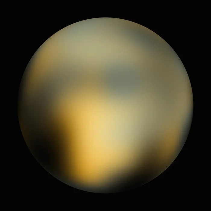
A blurry photo of Pluto, captured by the Hubble Space Telescope.
Credit: Credit: NASA, ESA and M. Buie (Southwest Research Institute)
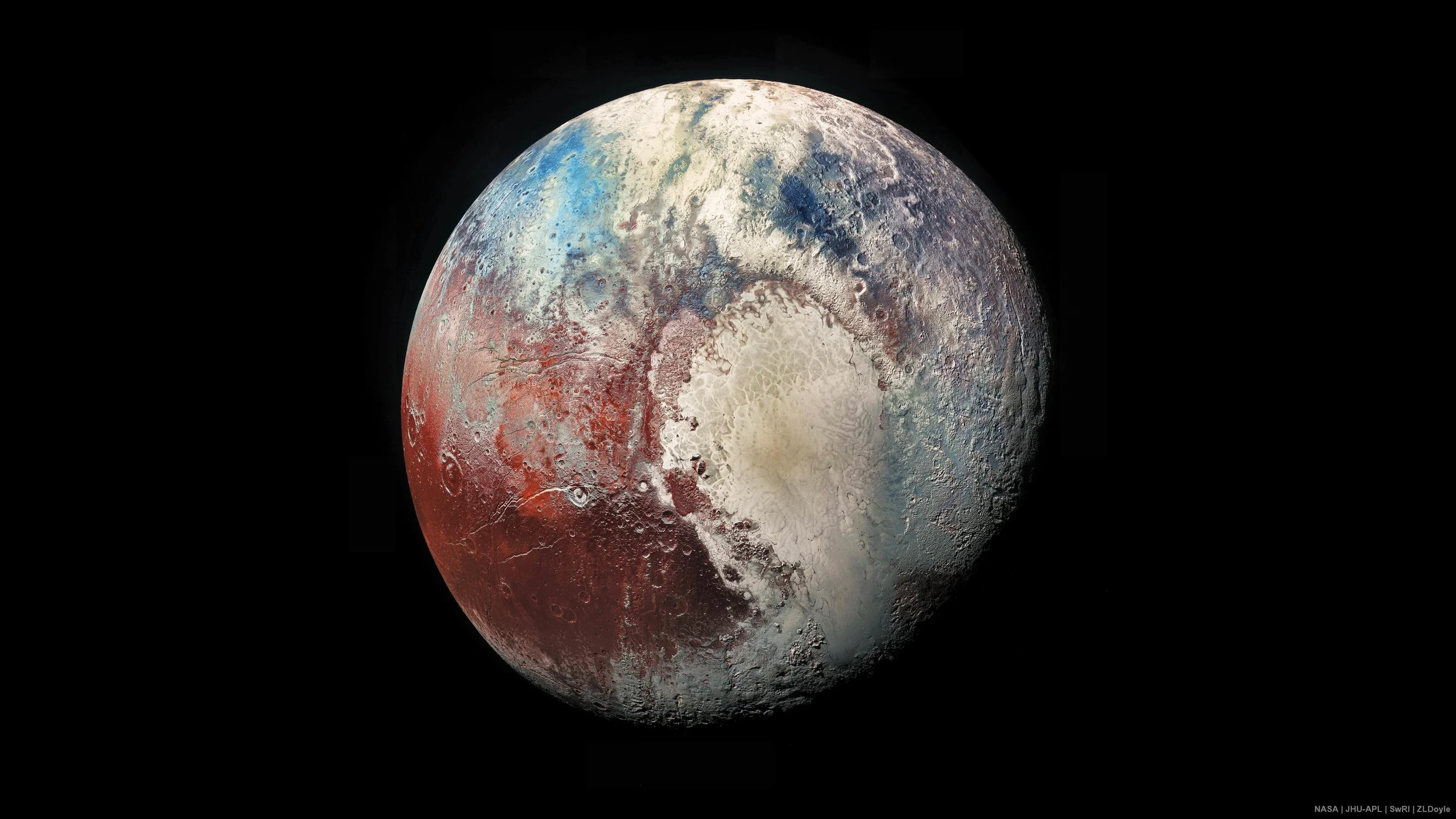
A high resolution image of the surface of Pluto, captured by New Horizons spacecraft.
Credit: NASA/Johns Hopkins University Applied Physics Laboratory/Southwest Research Institute
It was not until NASA’s New Horizons spacecraft flew by Pluto and captured high resolution imagery data in July 2015 that we had evidence that it was geologically interesting. Prior to that our knowledge of the surface of this mysterious world was limited. Pluto was also a relatively recent discovery. It was first observed on February 18th, 1930 by Clyde Tombaugh at the Lowell Observatory in Flagstaff Arizona, and for most of the time between its discovery and 2015 we didn’t know a lot about it. Interestingly, according to NASA’s Pluto facts page, it was named by an 11 year old girl, Venetia Burney of Oxford, England, whose grandfather had a connection to the observatory. She suggested it be named after the Roman god of the underworld, Pluto. To show why Pluto remained a mystery one simply needs to look to the image above and on the left. This is a photo of the dwarf planet captured by the Hubble Space Telescope. Until the launch of the James Webb Space Telescope in 2022, Hubble was the most sensitive and powerful telescope ever built. From this fuzzy image of Pluto alone, it was impossible to get an idea of what its surface looked like.
With NASA’s New Horizons mission, our understanding of Pluto changed forever. A distant dwarf world, about one third the size of Earth’s Moon, notably downgraded by the International Astronomical Union in 2006 from being the 9th planet in our solar system to a dwarf planet, we suddenly learned this hidden world was guarding incredible secrets waiting for our discovery. The image above on the right, along with DEM data, was captured by the Long Range Reconnaissance Imager (LORRI) and Multispectral Visible Imaging Camera (MVIC) onboard the New Horizons spacecraft at an elevation of roughly 10,000 miles above the surface. The imagery itself is gorgeous, showing an intense blend of rust red, to blue to white color spreads across a surface pockmarked by impact craters. Towering icy mountains give way to an extensive heart-shaped plain. It looks alien. Being named after the Roman god of the underworld seems fitting. I wonder if it is how Venetia Burney imagined it to be. Sadly, she died in 2009 and didn’t live to see these images.

A portrait photo of Venetia Burney, aged 11, the same age she named Pluto.
Credits: J. Weston & Son Photographers, Eastbourne, Brighton Source: https://en.wikipedia.org/wiki/Venetia_Burney#/media/File:Photo_of_Venetia_Burney,_aged_11,_c._1929.jpg

Lowell Observatory, where Pluto was first discovered.
Credit: By LittlefieldEmery - Own work, CC BY-SA 4.0, https://commons.wikimedia.org/w/index.php?curid=56516257
The journey getting to Pluto was long. New Horizons took 9 years and 5 months to reach the dwarf planet, which is just a waypoint on a much longer mission to the outer reaches of the solar system and, eventually, into interstellar space. To give you an appreciation of that distance, it took a whole 16 months for the full trove of data of Pluto to beam back to Earth. Let’s appreciate the hard work of a generation of scientists, technologists and fellow data nerds in getting this data to us so that we could experiment with it, learn from it and make beautiful stuff. You are one of the first people in human history that gets to make a topographic map of Pluto. Have fun with it!
Let’s Map Pluto
Below, I outline in detail the steps involved in getting high quality Digital Elevation Data (DEM) data of our small wanderer captured by New Horizons. Note: the dataset does not cover the entirety of the dwarf planet but still gives us a sizable chunk of terrain to work with. In what follows, I walk through how to create a nice looking topographic map of Pluto using out-of-the-box tools available in ArcGIS Pro. The workflows I follow can all be done using a standard Creator license without any additional extensions. After a little bit of fine tuning and incorporating design tools, we will end up with a detailed topographic map of Pluto that highlights the dwarf planet’s impressive and varied topography. From there, I strongly encourage you to make the map your own. Do what I do, but then do your own thing. Experiment with hillshades and color, explore other geoprocessing tools, try different approaches. I would love to see anything you make in the comments or tag me on Instagram @XtianMaps
Note: this map (or one very similar) can also be created in open source GIS software, including QGIS, which I plan to revisit in a future post.
Step 1. Getting Your Data
The United States Geological Survey (USGS) Astrogeology Center’s website curates an excellent spatial data repository called Astropedia that features Digital Elevation Models (DEMs) and imagery of celestial objects within our solar system, including the DEM data captured by New Horizons as it transited past Pluto.
The Pluto DEM data can be accessed here: https://astrogeology.usgs.gov/search/map/pluto_new_horizons_lorri_mvic_global_dem_300m

Credit: USGS and NASA
To download this dataset, navigate to the top left corner of the page and click the link labeled “Download ((591 mb))”. This may take a few minutes to download, depending on the speed of your internet connection. Ignore the ‘Sample’ URL. Once the file has successfully downloaded, save it to your machine in a file location you will remember.
Step 2: Bring the DEM into ArcGIS Pro
Launch ArcGIS Pro and create a new project. Save the project to a location you will remember. Throughout this exercise, it is a good idea to periodically save your work as you go.
Next, right click in the Table of Contents window on the left side of your screen, and select add data. Navigate to where you saved your DEM dataset and select it. This will bring it into the ArcGIS Pro project. This process may take a moment. When it loads, you should see something like this:
Description: a Digital Elevation Model (DEM) of Pluto, as it appears in ArcGIS Pro.
With the DEM loaded into our project, we can begin to see a world with varied terrain. Even before we do any processing, one can easily distinguish between craters, valleys, and channels across the world’s pockmarked surface. You will also notice you do not have a full view of the dwarf planet, and instead see a sort of v-shape. This is a limitation of the data and it only features DEM data for the hemisphere that was visible to New Horizons during the spacecraft’s closest approach. One item I wanted to briefly note here is the projection coordinate system. If you right click on the DEM layer in the Table of Contents, navigate to the Source option on the left, then open the Spatial Extent option, it shows the Projected Coordinate System as SimpleCylindarical_Pluto and the Projection type as a Equidistant Cylindrical.
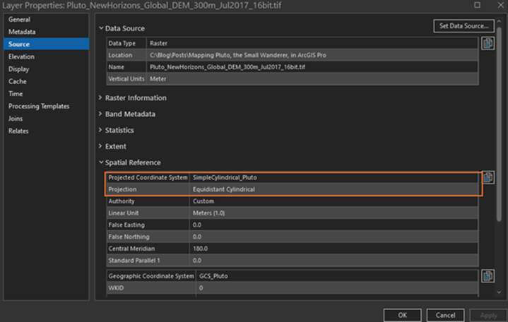
Description: Pluto’s custom projected Coordinate System: Simple Cylindrical Pluto
It makes sense that there is a custom coordinate system for Pluto, given that it is about ⅓ the size of Earth’s Moon and the math to represent a spherical object on a 2D map is going to be slightly different. Next, let’s explore tools that will allow us to see even more detail.
Step 3: Use Raster Function Tools
Navigate to the Analysis ribbon at the top of your screen and select the Raster Functions pane on the right.
Hillshading
A window called Raster Functions will open, hosting a trove of tools made for raster data. We will only be using two functions, hillshade and slope, but feel free to explore the other functions on your own. In the Raster Function pane’s search bar, type hillshade and select it from the options that appear below.

ArcGIS Pro Hillshade Function

Description: ArcGIS Pro Raster Functions panel
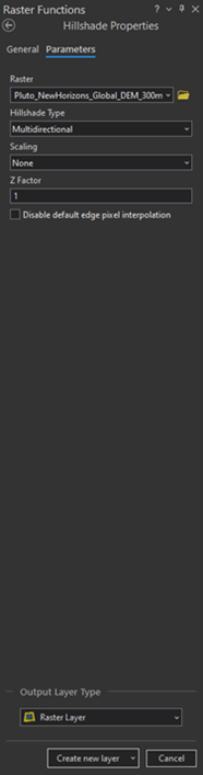
Multidirectional Hillshade
For the first hillshade, ensure the Pluto DEM is set as the Raster. To confirm this, with the Hillshade Properties window open, navigate to the Raster options and from the dropdown menu, select the Pluto DEM file.
For the Hillshade type, select Multidirectional. This will give us a beautiful first layer. According to Esri’s documentation on hillshades, the multidirectional hillshade tool uses an algorithm to visualize hillshades from six different directions as opposed to a single direction used by the traditional hillshade function, which we will explore in greater detail a little further down.
For scale, select None and for Z Factor keep it set to 1. Click the “Create New Layer” button.
Description: ArcGIS Pro Raster Functions panel
With that you have your first hillshade of Pluto!
Let’s look at our results. Below is the original Digital Elevation Model (DEM), followed by the multidirectional hillshade we just made.

Description: Looking at a zoomed in area of Pluto with only the original DEM layer.
Description: looking at the same zoomed in area of Pluto, but this time with a multidirectional hillshade being visualized.
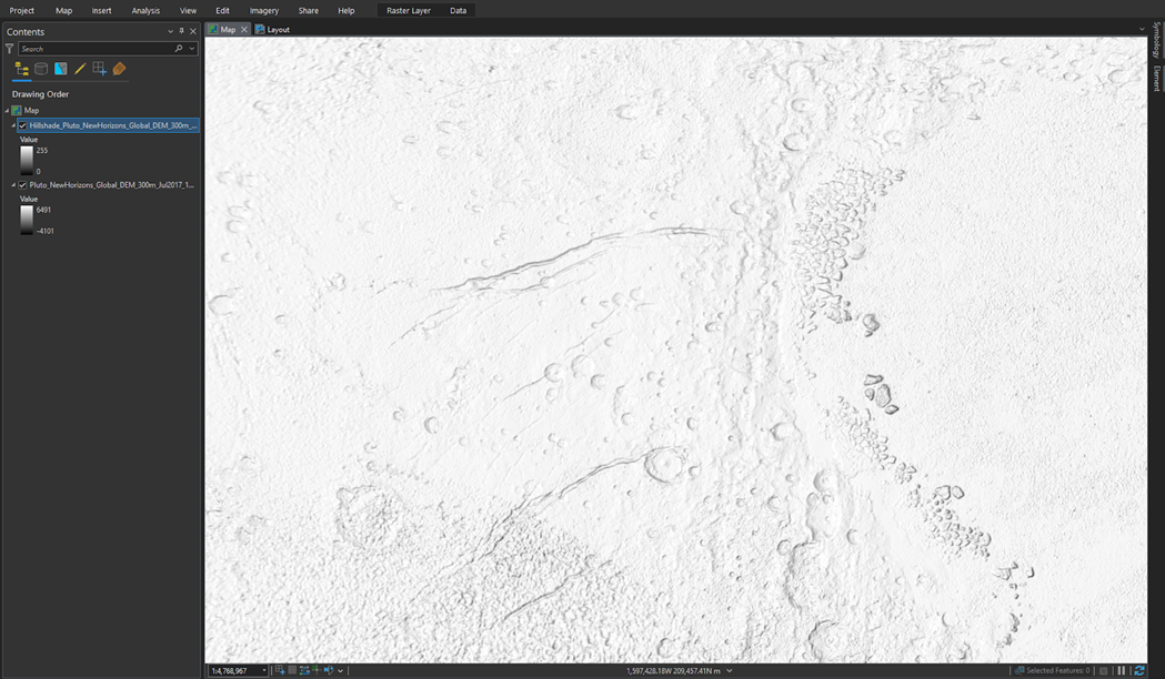
You can see the DEM layer shows distinct landscape features. However, with our newly created multidirectional hillshade layer toggled on, an even sharper image of Pluto’s surface begins to emerge. Let’s make a few more layers. Later we will stack these layers on top of one another and use tools that will blend them all together. Next, let’s make a traditional hillshade.
Traditional Hillshade
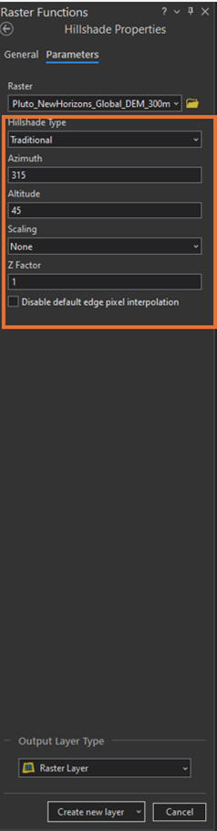
Whereas a multidirectional hillshade uses an algorithm to calculate sunlight falling on the landscape at six different angles, a traditional hillshade involves more (or less - if you stick to default settings) decision making. The traditional hillshade method mimics the effect of sunlight coming from just one direction, with the end user having the ability to specify both the altitude (the slope or angle of the sun above the horizon, measured between 0 - 90 degrees) and azimuth (the sun's relative position along the horizon, measured between 0 - 360 degrees). For this map we will start with the default settings (boring, but it will get the job done and we will revisit custom parameters later).
If needed, navigate to the Analysis pane and select Raster Functions again. In the search bar, type hillshade and select Hillshade.

Description: ArcGIS Pro Raster Functions panel
For Raster, ensure the Pluto DEM is selected. For Hillshade Type, select “Traditional”, while keeping defaults for the remaining fields, including azimuth, altitude, scaling, and Z factor.
Description: A screenshot of the ArcGIS Pro Raster Functions window.
Click the “Create new layer” button and you will get something resembling this:

Description: Traditional Hillshade of Pluto.
As a note, I like to rename layers that I create as I go to remember what they are (e.g., multidirectional hillshade, traditional hillshade …etc). You can do this by right clicking on them in the Table of Contents and selecting the Rename option. Feel free to name them however you like, or keep the default names.
The Traditional Hillshade layer appears to be darker than the previous multi-directional hillshade. This helps better define and highlight valleys, craters, mountains and other topographic variation by emphasizing shadows. Again, we will mix this with our other layers to create a complex, nuanced view of Pluto’s surface.
Before we begin to mix our layers, let’s create one more for the sole purpose of highlighting the edges of the landscape. We can accomplish this with the slope tool.
Slope
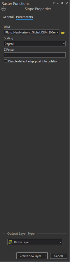
This tool is intended to visualize the steepness of terrain, but with some fine tuning we can have it highlight Pluto’s canyon, crater and mountain edges. To access the slope tool, navigate back to the Raster Functions pane. Type in Slope in the search bar and select it.
Description: ArcGIS Pro Raster Functions panel
In the Slope Properties window, ensure the Pluto DEM layer is selected as the DEM. Keep the rest of the default settings as is and click “Create new layer”.
Description: the slope Properties window.

Description: except of a Slope created from the Pluto DEM.
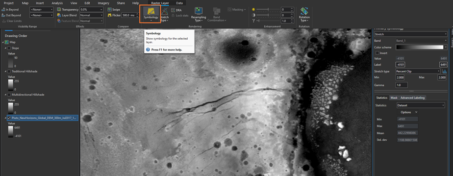
This looks neat! Check out the areas in white. These are the edges of the canyons, craters, and valleys we see in the hillshades above. The darkness of the surrounding landscape looks a little busy though. Let’s utilize a visual trick for bringing the focus on these edges and make this image less noisy. With the Slope layer selected in the Table of Contents, navigate to Raster Layers, and click Symbology.

Description: ArcGIS Pro Symbology menu.
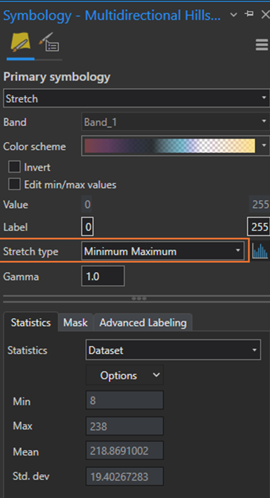
This will open a symbology pane. Check out the color ramp, by default it goes from dark to light. Directly underneath the color ramp is a button that is currently unchecked labeled “Invert”. Check that option and this will flip the color ramp.

Description: Symbology settings for the slope layer.
You should see something resembling the screenshot below:

Description: the slope layer with the symbology changes applied.
The result is much better. We can more clearly make out landscape features without being visually overwhelmed. The slope tool is excellent for highlighting details in the terrain, regardless of whether you’re mapping Pluto, Mars, Earth, the Moon, or wherever.
Fine Tuning
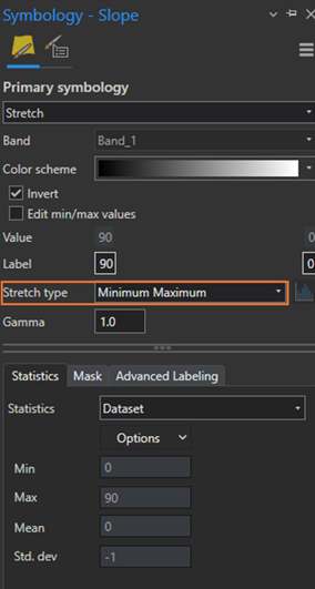
Before we continue, let’s take a moment to adjust something called stretch type, which can be found in a layer’s symbology pane. This adjusts the strength of the light, impacting its brightness and contrast. You can use stretch types to make your hillshade look better.nFor this map, I am going to use the Minimum-Maximum stretch type for the slope and hillshade layers. For the DEM layer, I am going for the percent clip stretch type.
To adjust stretch type, navigate back to each layer’s symbology pane. About halfway down you will see Stretch type with a dropdown menu of options. Toggle each layer on and off to see changes from before and after a stretch type is applied.
Description: adjusting stretch type
I made the following changes by layer:
Slope = Minimum Maximum
Traditional Hillshade = Minimum Maximum
Multidirectional Hillshade = Minimum Maximum
DEM = Percent Clip (Min .5, Max 3)
So far so good, but we need to make some more adjustments. Even though the other layers are turned on, the slope layer is currently the only one we can see. This is because it is layered on top of the others and uses a solid color scheme. We can address this by applying transparency and custom styles to our layers.
Adjusting Transparency Levels
Before proceeding, make sure all three layers are checkmarked “on” in the Table of Contents pane.
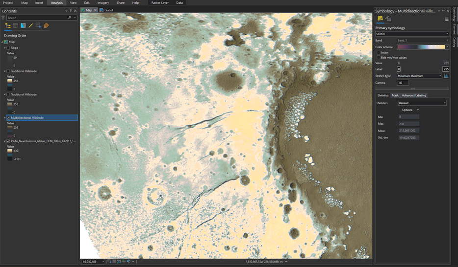
Next, adjust the slope layer to be more transparent. To do this, select the slope layer in the Table of Contents, then navigate to the Raster Layer ribbon, and select the Transparency tool located in the top left of your screen. Set transparency to 85%.This will bring out edges within the terrain, but will also bring in the details from the layer immediately underneath, which in this case is the traditional hillshade layer.

Description: adjusting the Slope layer’s transparency
You should see something similar to what’s shared below:

Description: Pluto’s surface after applying transparency to the slope layer.
This gives us a subtle view of the edges of craters and valleys. As we experiment with the other layers, a sharper image of Pluto’s terrain will emerge. But what about the multidirectional hillshade and DEM layers that remain hidden? In addition to playing with transparency settings , we have a couple of other options in how we can bring these back into our map. For this map, we are going to pull in a custom style and continue leveraging transparency to make the terrain stand out more.
A Brief Note on Blend Modes
One feature that could also help us is something called blend modes. I will not be covering these in detail, but wanted to mention them. These come standard with ArcGIS Pro and worth exploring on your own. I like incorporating them whenever I am working with aerial imagery and overlaying it against terrain (FYI: NASA has mosaic Pluto imagery that you could georeference on your own and bring into your map if you’re nasty).
I have found blend modes very useful in designing better maps, but the number of options can be a bit overwhelming. Esri has a Blend Mode Helper that you may want to check out. You may want to reference Esri’s documentation on Transparency and Blend Modes.
Importing Styles
Did you know you can access a library of mapping symbologies, called styles, beyond what comes out of the box and preloaded in ArcGIS? Esri has a vast store of styles you can bring into any ArcGIS project to make it look even better.
For this map, we are going to borrow the Imhof style for ArcGIS Pro by John Nelson - thanks John Nelson! (he is a fantastic cartographer and teacher. If you don’t follow him, you should pause here and go do that).
To download the Imhof style, go to the URL below:
https://hub.arcgis.com/content/1f25b31793cd4e7391b0cd51b9b79783/about
Then, click the Download button. This style will download to your PC.

Description: The webpage where you can download the Imhof style.

Description: the license details for this style - use as you please!
Once the style file has downloaded, save it somewhere you will remember. Now, you are ready to import the Imhof style into your ArcGIS Pro project. To bring this style, or any other, into your project, launch the Catalog window by going to the View tab and selecting the Catalog Pane option.

Description: the Catalog Pane in ArcGIS Pro, highlighted
You will see the Catalog window appear on the right of your screen. Scroll down to the Styles menu, double click it, and navigate to wherever you saved your download.
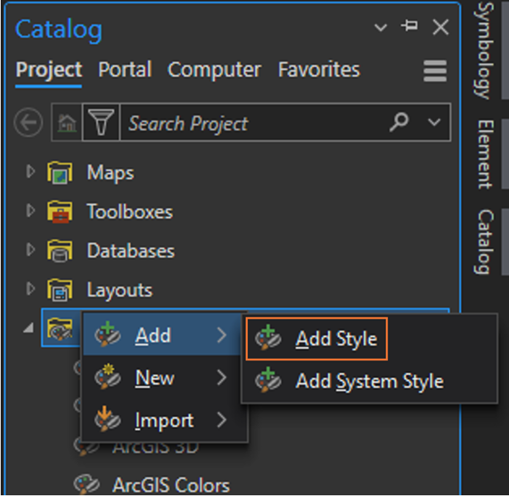
Description: the Add Styles menu, located in ArcGIS Pro’s catalog pane.
Selecting the style file and then click OK.
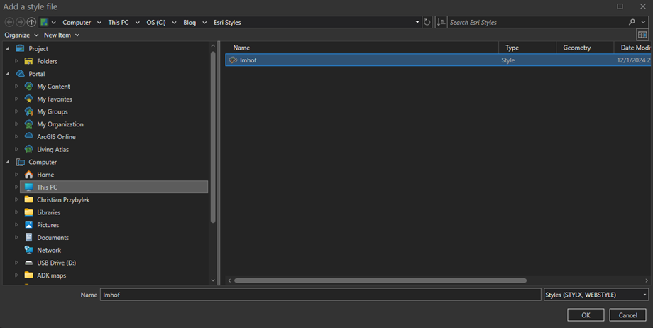
Description: Selecting the Imhof style, via the Add Styles menu, from wherever you downloaded it to.
You can confirm the style loaded into the project by checking to see if Imhof is listed under the Styles menu in the Catalog window.
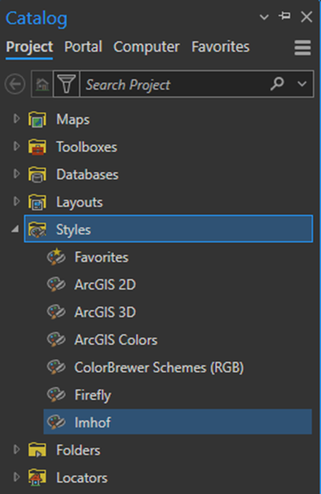
Description: confirming the Imhof style has been successfully added to ArcGIS Pro.
Now you are ready to cook. To incorporate the Imhof style, open your layer’s Symbology and you should see that this new style package will be available for use. Let’s apply it to the DEM layer first. Toggle all other layers off for now. Select the DEM layer in the Table of Contents, navigate to the Raster Layer pane and select Symbology. On the right side of your screen, the symbology window appears.
Description: navigating back to a layer’s symbology window, where you will now be able to apply the custom Imhof style to project layers.
Navigate to the color scheme field. A dropdown menu will appear, make sure that the Show All and Show Names boxes at the bottom are both checked, then select Hillshade Traditional.

Description: applying the Imhof style to your DEM layer in ArcGIS Pro
Reconfirm that the Stretch type is set to Percent Clip and that the Min value = .5 and max value put 3. The result should look like this:

Description: our DEM of Pluto after the Imhof style has been applied.
Next, select the Multidirectional Hillshade layer in the Table of Contents (you may have used a different layer name). Make sure the layer is toggled on. Following the same steps as before, change the symbology to Hillshade Multidirectional. For Stretch type, confirm Minimum Maximum is selected.
Description: confirming minimum -maximum stretch type is applied to the multidirectional hillshade layer.
With the layer selected, navigate to the top of the screen, click the Raster tab, then select Transparency and set it to 50%.

Description: setting transparency in ArcGIS Pro
Your map should look like this:
Description: Imhof style applied to Pluto
Next, select the Traditional Hillshade layer and toggle it on. Apply the Hillshade Traditional symbology and for stretch type, again use the Minimum Maximum. Again, set transparency for this layer to 50%.
This is what you should see:
Description: transparency applied to the traditional hillshade layer
Now we are going to make a new Traditional Hillshade layer and stack it above the existing Traditional Hillshade layer. This time though, we are going to adjust the Altitude. Set it to 30.
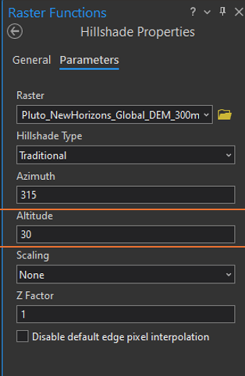
Description: Raster Functions window, with Altitude being adjusted.
Stack this resulting hillshade above the Traditional Hillshade layer and adjust symbology so that the Terrain Hillshade style is selected. Adjust the Stretch Type to Minimum Maximum.
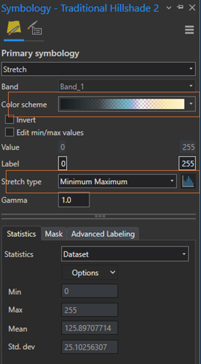
Description: Adjust the traditional hillshade stretch type to Minimum - Maximum.
Finally, go back to the slope layer we made at the beginning and ensure it is still situated at the top in the Table of Contents and confirm it is toggled on. That should do it! Our map should look like the excerpts below.
Zoomed in Areas of Pluto’s surface:

Description: a hillshade of Pluto’s surface highlighting a region named Sputnik Planum

Description: a zoomed in view of an area along the rim of Sputnik Planum

Description: a Hillshade of Pluto
Conclusion
With a DEM, a few raster tools and some custom styles we were able to create a detailed map of another world. If you’re looking for an additional challenge, try fine tuning your map and make it your own. Explore different hillshade altitudes and azimuths, experiment with color, style and transparency and explore new Raster Functions (Shaded Relief might look neat!).
I would love to see what you come up with! Post your own unique maps in the comments below and/or tag my blog’s instagram at @xtianmaps. Thanks for following along and happy mapping!